Your “Best Sellers” Page Is Doing Less Work Than You Think
1 May 2026
Deanna Pillay
Shopify Services Lead
I'm passionate about how technology can transform customer experiences and drive e-commerce growth. I help businesses unlock results through customer-focused, practical digital strategies. With a background across e-commerce, account leadership, digital project management, and strategy, I work at the intersection of thinking and doing — turning ideas into measurable outcomes.
Tags
A short POV that started as a thought and ended up worth writing down.
I wrote a version of this last week as a quick note to myself, the kind of thing you scribble down before it slips. A few conversations later, and some time down a research rabbit hole, it turned into one of those thoughts that takes up more mental space than it should.
The note was about Best Sellers pages.
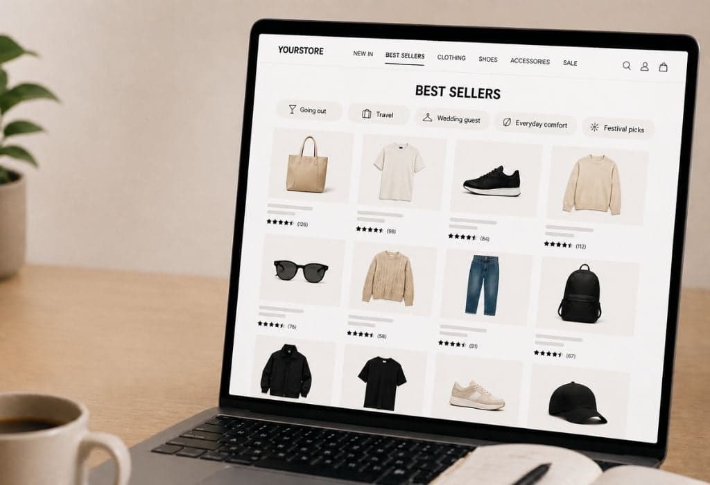
Almost every ecommerce store has one. It usually sits in prime nav real estate, first or second slot, right next to “New In.” And almost all of them feel the same when you click in: a 100+ product grid of all sorts of bits and pieces, sorted by units sold, with no context, no edit, no point of view. The digital equivalent of a sales assistant pointing at the back wall and saying “that lot’s popular, knock yourself out.”
The thing is, it gets the clicks. Baymard’s research shows that on stores that offer one, 23% of users use the Best Sellers category as their first move from the homepage. That’s not a dead link. It’s a meaningful chunk of intent landing on a page that, in most cases, isn’t designed to do anything with it.
That’s the bit that kept me thinking.

“Popular” stopped being a useful filter
The assumption underneath a Best Sellers page is that aggregate popularity is the most useful sort order for any individual shopper. In 2015, that wasn’t a bad bet. In 2026, it’s a stretch.
People don’t shop in the abstract anymore. They show up with a job to do, a birthday outfit, a work trip, a wedding to dress for, a gift for someone specific. They don’t want to know what’s popular with everyone. They want to know what works for the moment they’re in.
The data is pretty blunt on this. McKinsey found that 71% of consumers expect personalised interactions, and 76% get frustrated when experiences aren’t tailored. A separate report puts it more commercially: 50% of consumers are likely to switch brands if a company doesn’t anticipate their needs.
A Best Sellers grid does the opposite of anticipating. It hands the shopper everyone else’s average and asks them to do the filtering work themselves.
And here’s the thing about overwhelming shoppers with choice. It doesn’t just frustrate them, it stops them buying. The research on choice overload is consistent. Too many undifferentiated options and conversion drops. Not slightly. Measurably.
The fix is smaller than most teams think
The conversation I kept having wasn’t about a tech project. It was about a merchandising decision most teams are over-complicating.
The answer isn’t a full rebuild. It’s quick filters and collection tiles sitting on top of the existing page, giving shoppers a way to self-select into something relevant before they’re faced with the full grid.
Something like:
- Going out
- Travel
- Wedding guest
- Everyday comfort
- Festival picks
Same data. Same products. A few tile links and a filter strip, and suddenly the page has a point of view. The shopper who arrives knowing what they’re shopping for gets a fast route in. The one who’s browsing gets a prompt that does the thinking for them.
The same logic applies at product level. A “Best Seller” badge is fine, but “Popular for nights out” or “A go-to for repeat buyers” does more work. Same underlying truth, far more relevance to the shopper looking at it.
The brands converting well aren’t the ones with the longest Best Sellers grid. They’re the ones treating merchandising as a service to the shopper rather than a sort order.

The honest pushback
Best Sellers isn’t useless. The badge still works as social proof on a product page. Research consistently shows lifts of around 25% in conversion when it’s used well at PDP level. For first-time visitors with no behavioural signal at all, popularity is a sensible cold-start default.
The argument isn’t that Best Sellers should disappear. It’s that it shouldn’t be the answer to every shopper’s question, especially not the one they’re asking when they click the nav link.
What I took away
If your Best Sellers link is one of your top-clicked nav items, that’s a high-traffic moment you’re either using or wasting.
Used well, it’s an entry point that lifts both conversion and AOV. Used the way most stores use it, it’s a generic grid that quietly sends shoppers back to the search bar, or worse, back to Google.
The work to fix it is small. The upside is not.
Curious whether anyone else is sitting on the same problem, or if you're adding this to your Monday stats check-in.