How Colour Choices Affect Website Conversions
25 October 2023

Roberta Johnston
SEO Lead
I'm an SEO specialist with over 8 years of experience helping brands grow through strategic, data-driven search optimisation. I've worked with large e-commerce websites and niche brands alike, developing a deep understanding of ranking algorithms, generative AI, and LLMs like ChatGPT, Perplexity AI, and Gemini. My expertise spans technical SEO, ensuring sites - whether a few dozen pages or 100,000+ - are crawled and indexed effectively.
Tags
In the dynamic world of ecommerce, every detail matters. From the layout of your homepage to the fonts you choose, each element can influence the way your visitors interact with your website and, ultimately, whether they convert into customers. Among these elements, colour is a silent yet powerful player in the game.
Welcome to a world where shades and hues go beyond aesthetics and delve deep into the human psyche. This blog explores the fascinating realm of colour psychology and how the strategic use of colours in web design can significantly impact your conversion rates. Whether you're an ecommerce business owner looking to boost your sales or a brand embarking on a rebranding journey, understanding the psychology of colour is your key to success.
In this article, we'll uncover the secrets of how colour choices can affect your ecommerce conversions. We'll also dive into practical strategies for utilising colour psychology to your advantage, ensuring that your web design resonates with your audience and drives those all-important conversions.
Let's explore the captivating world of colour psychology in ecommerce and discover the hues that can take your online business to the next level.

What is Colour Psychology?
Colour psychology is the fascinating study of how different colours can evoke emotional and psychological responses in people. It delves into the profound ways colours can impact our moods, decisions, and even our purchasing behaviour. In the context of web design and ecommerce, understanding the fundamentals of colour psychology is essential for creating a website that resonates with your target audience and maximises your conversion rates.
When we look at colours, we often don't realise the subtle yet profound ways they influence our perceptions and actions. Different colours can evoke feelings of trust, excitement, calmness, or urgency. For instance, red can create a sense of urgency and energy, while blue might convey trust and serenity. The meanings associated with colours are culturally and contextually dependent, which is why it's crucial to consider your specific audience when selecting the right colour scheme for your ecommerce website.
Colour psychology extends beyond mere aesthetics; it's a science that impacts your ecommerce business's bottom line. By understanding the emotional and psychological triggers associated with different colours, you can strategically leverage them in your web design to enhance user experience, boost trust, and ultimately drive more conversions.
How Does Colour in Web Design Affect Conversion Rates?
The relationship between colour and conversion rates in web design is more intertwined than you might think. Whether you're aware of it or not, the colours you choose for your website can significantly influence how visitors engage with your content and, ultimately, whether they make a purchase or exit your site.
Here are a few key ways in which colour affects conversion rates:
Attention and Engagement
Colours can draw attention to specific elements on your website. For instance, using bold and contrasting colours for your call-to-action (CTA) buttons can make them more noticeable, prompting visitors to click. This can directly impact your conversion rate.
Trust and Credibility
Certain colours, like blue and green, are associated with trust and reliability. If your website primarily uses these colours, it can help establish trust with your audience, making them more likely to convert.
Emotional Impact
Colours evoke emotions. Red, for instance, is often associated with passion and excitement, while pastel colours can create a sense of calmness. Depending on your brand's personality and the emotions you want to convey, your colour choices can influence how visitors feel and act on your site.
Brand Recognition
Consistency in your colour scheme and branding is essential for recognition. When visitors see your brand's colours, they should immediately associate them with your products or services. This recognition can lead to higher conversions, especially from repeat customers.
Related: Is Brand Awareness Important for Ecommerce Websites?
However, it's crucial to remember that there's no one-size-fits-all answer when it comes to colour choices for conversion optimisation. What works for one brand may not work for another, as it heavily depends on your target audience, industry, and the context in which your colours are used.

Can Colours Improve Conversion Rate?
Absolutely, colours have the potential to boost your website's conversion rate. However, it's not about randomly picking your favourite colours. Effective use of colour requires an understanding of colour psychology, your brand identity, and your target audience.
Let's explore how colours can enhance conversion rates:
Contrast and Call-to-Action Buttons
The most common and direct way to use colour for conversions is with your call-to-action (CTA) buttons. To make them stand out, choose a colour that contrasts with your website's dominant colours. This contrast draws attention and encourages action, such as clicking a "Buy Now" button.
Build Trust and Credibility
As mentioned earlier, colours can influence perceptions of trustworthiness. Blue, for example, is often associated with trust and dependability. Using this colour prominently in your design can help establish trust with visitors, making them more likely to complete a purchase or sign up for your services.
Consider Emotional Impact
Consider the emotional response you want to evoke. If your brand aims to convey excitement, red or orange may be suitable choices. If you want to appear calm and reliable, blues and greens might be more appropriate. These emotions can influence a visitor's willingness to convert.
Consistency and Branding
Colour consistency is essential for brand recognition. When visitors see your brand's signature colours across your website, they'll quickly associate them with your products or services. This association leads to trust and, subsequently, higher conversion rates.
Age and Gender Preferences
Studies have shown that age and gender can influence colour preferences. Understanding your target demographic's colour inclinations can help tailor your design to increase conversions. For instance, soft and warm colours might resonate more with older audiences, while younger consumers might respond better to vibrant and trendy hues.
While these principles can guide your colour choices, it's crucial to conduct A/B testing to determine what works best for your specific audience. Different colour variations can have vastly different impacts on conversion rates. By experimenting with colour choices, you can find the optimal combination for your website.

How to Use Colour Psychology to Increase Website Conversions
Now that we understand the impact of colours on conversion rates, let's delve into how to effectively implement colour psychology to boost your website's conversions.
1. Understand Your Audience: First and foremost, get to know your target audience. Consider their demographics, preferences, and emotional triggers. This insight will guide your colour choices.
2. Start with a Dominant Colour: Every website has a dominant colour that reflects its brand identity. This primary colour should set the overall tone. Use it for backgrounds, headers, and footers. If your brand uses multiple colours, ensure they are harmonious.
3. Accentuate CTAs: Your call-to-action buttons are the most critical elements for conversions. Choose a colour that contrasts with your dominant colour to make CTAs stand out. It's common to use colours like red, green, or orange for this purpose.
4. Communicate Emotions: Select colours based on the emotions you want to evoke. Red can signify urgency and excitement, while blue conveys trust and dependability. Use these emotions strategically. For instance, an ecommerce site might use red for limited-time offers and blue for customer testimonials.
5. Create a Balanced Palette: While you can use contrasting colours for CTAs, maintain a cohesive palette. Consistency in colour schemes throughout your site reinforces brand identity and builds trust.
6. Test Different Variations: A/B testing is your ally. Experiment with different colour combinations and monitor their impact on conversions. Testing helps you fine-tune your choices based on real user behaviour.
7. Leverage Colour Theory: Understanding colour theory can be invaluable. Complementary colours (opposites on the colour wheel) create visual contrast, while analogous colours (close on the wheel) provide harmony. Explore these theories to achieve the right balance.
8. Prioritise Readability: Don't compromise on readability. Ensure that text and background colours contrast well to make your content easily legible.
9. User Experience Matters: Colour can influence the overall user experience. A well-designed, visually appealing website encourages users to stay longer and explore more, increasing the chances of conversions.
10. Mobile Optimisation: Keep in mind that users visit your website on various devices. Ensure your colour choices work well on both desktop and mobile screens.
11. Stay Updated: Trends in colour and design evolve. Regularly review your colour choices to ensure they remain relevant and effective.
Remember, while colour psychology can be a powerful tool for improving conversions, it's not the sole factor. Combine it with other conversion rate optimisation (CRO) strategies like clear navigation, persuasive copywriting, and user-friendly interfaces for the best results.
The Relationship Between Colour Choice and Web Design
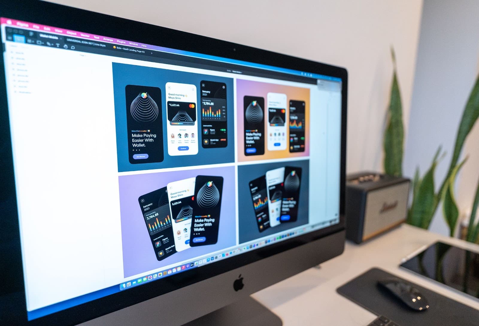
In web design, colour choice is not an isolated decision; it interacts with various elements to create a holistic user experience. The relationship between colour and web design is intricate and requires thoughtful consideration for an effective and visually appealing website.
1. Maintain Consistency: Consistency is the key to creating a visually pleasing website. Ensure your colour scheme aligns with your brand identity and remains uniform throughout the site.
2. Balance is Crucial: Effective design strikes a balance between vibrant colours that grab attention and subtler shades that provide a relaxing backdrop. This equilibrium guides users through the website's content without overwhelming them.
3. Colour Hierarchy: Establish a colour hierarchy to direct the user's attention to critical elements. For instance, the main content text should be a neutral, easy-to-read colour, while interactive elements like CTAs should stand out more.
4. Contrast for Clarity: A colour scheme that incorporates contrast can enhance user comprehension. The combination of contrasting colours between text and background ensures that content is easy to read.
5. Responsive Design: Consider responsive design principles when selecting colours. Colours should adapt seamlessly to different screen sizes and orientations without losing their impact.
Keep Reading: Why is a Responsive Website Crucial for Ecommerce?
6. Emotional Flow: Your choice of colours should align with the emotional flow of your website. The progression of colours from landing pages to product pages to checkout should feel seamless and evoke the desired emotions at each stage.
7. User-Centric Approach: Effective design should revolve around the user's experience. Consider accessibility; ensure your colour choices are accommodating to all users, including those with visual impairments.
8. The Impact of White Space: White space is an essential part of web design. The judicious use of white space between text, images, and other elements can make your website more appealing and user-friendly.
9. Colour and Brand Messaging: Your chosen colours should reflect your brand's messaging and values. For instance, eco-friendly brands might use green to convey sustainability, while high-tech companies might opt for futuristic blues and metallic tones.
10. Enhance User Engagement: Colour choices can enhance user engagement and direct users' attention where it matters most. For example, a red button for "Buy Now" can drive engagement and boost conversions.
The art of web design lies in orchestrating colours harmoniously with other design elements to create a seamless user experience. When colours and design work together, they captivate visitors and guide them through your site with intent.
Best Practices for the Implementation of Colour Within Your Brand's Style
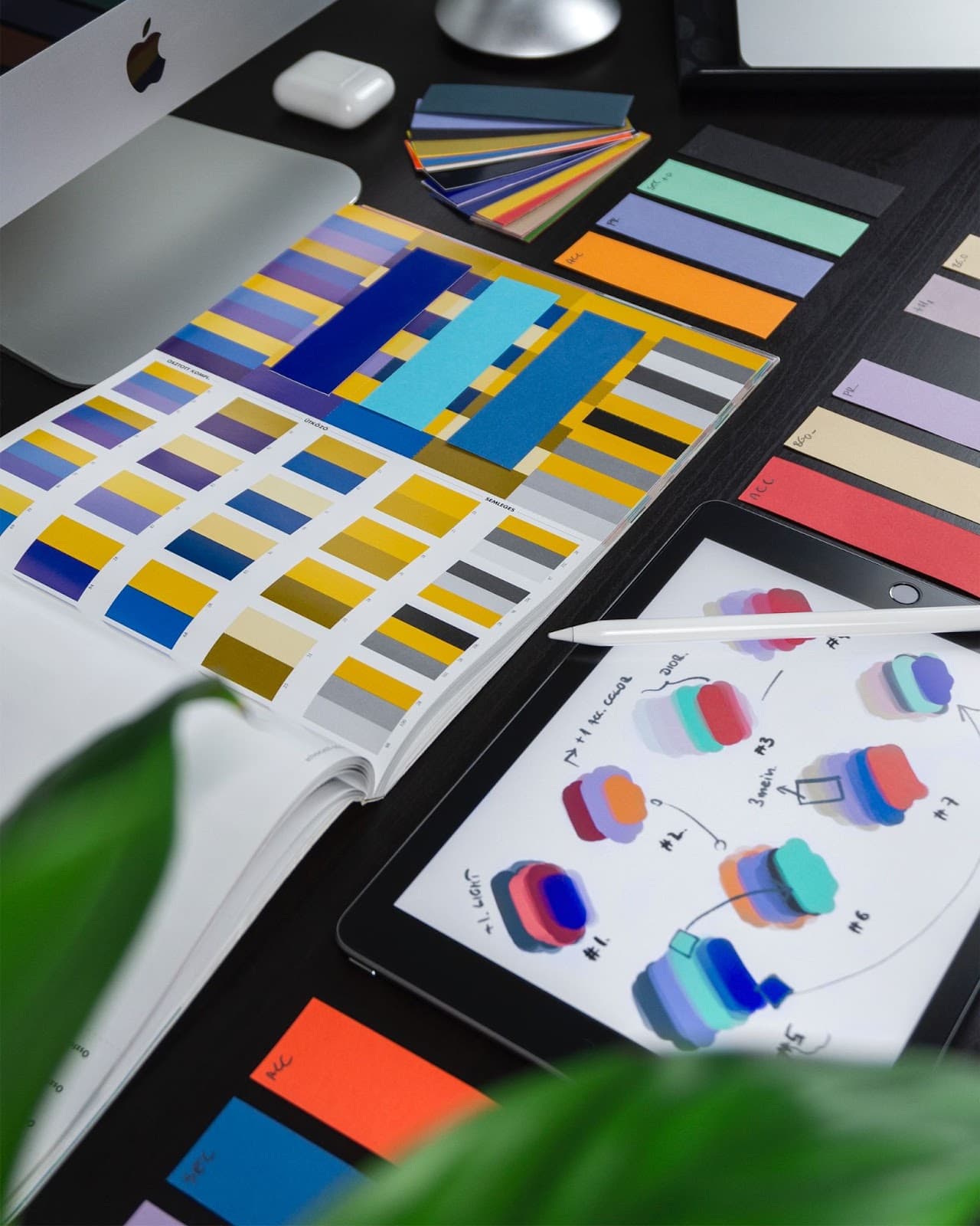
Integrating the psychology of colour into your ecommerce website can be a game-changer, but it's not as simple as picking a few shades and throwing them together. There are some best practices you should keep in mind to effectively implement colour within your brand's style:
Start with Brand Identity
Begin by aligning your colour choices with your brand's core identity. If your brand values are centred around sustainability, earthy and natural tones might work best. Conversely, a high-tech brand might lean towards vibrant, futuristic colours.
Keep It Consistent
Consistency is crucial. Your chosen colour scheme should extend across your website, marketing materials, and even packaging. This consistency helps in solidifying brand recognition.
Go Beyond Aesthetics
Your colour choices shouldn't just be about aesthetics; they should serve a functional purpose. For example, if you want to highlight a CTA, choose a contrasting colour to make it pop.
Focus on Readability
The colours you use for text and background need to ensure readability. Dark text on a light background or vice versa is a standard choice, but it can be customised to match your brand's personality.
Pay Attention to Colour Emotion
Each colour conveys a unique emotion or association. Understand what your primary and secondary colours communicate and ensure they resonate with your brand's message.
Don't Overdo It
While your colour scheme should reflect your brand, avoid overloading your website with too many colours. A few primary and secondary colours, plus neutrals, can create a cohesive look.
Consider Cultural Nuances
If your brand operates internationally, be mindful of the cultural associations of different colours. Red, for example, can symbolise love in one culture and danger in another.
Test and Refine
Once you've implemented your colour scheme, use A/B testing to gauge its effectiveness. This helps in refining your colour choices based on real user responses and data.
Seek Professional Guidance
If you're uncertain about the psychology of colour or how to implement it, don't hesitate to seek professional design or branding advice. Our web design and UI experts at Blackpepper can help you navigate the complexities of colour.
Effective integration of colour into your brand's style requires a delicate balance of creativity and strategy. By thoughtfully selecting and implementing colours, your ecommerce website can enhance the user experience and, ultimately, drive conversions.

Beyond Colours: A Holistic Approach to Conversion Rate Optimisation
In the quest to boost your website's conversion rates, it's crucial to understand that colour psychology is just one piece of the puzzle. A comprehensive strategy encompasses several key elements that work in harmony to maximise your website's potential.
Keep Reading: How to Improve Ecommerce Website Conversion Rates
User Experience (UX) Design: Your website's visual appeal and ease of navigation profoundly influence its conversion rates. A well-structured, user-friendly site is far more likely to convert visitors into customers. In a world increasingly dominated by mobile devices, responsive design is a must. Your site should not only look good but also function seamlessly on various screens.
Page Speed: The speed at which your website loads can be a make-or-break factor. Slow-loading pages frustrate visitors and often send them looking elsewhere. Ensuring your site loads quickly is a fundamental step toward improving conversions.
Content Quality: High-quality, engaging content plays a pivotal role in building trust and credibility. It not only showcases your expertise but also keeps visitors returning for more. The right content can guide visitors through the conversion funnel.
Clear Call-to-Actions (CTAs): Effective CTAs guide visitors toward the desired action, whether it's making a purchase, signing up for a newsletter, or filling out a contact form. These calls to action should be prominent and compelling, simplifying the decision-making process for users.
Customer Feedback: Actively seek feedback from your customers to understand their needs and pain points. Their insights can be invaluable in making necessary adjustments to improve conversions.
Trust Signals: Ensure your website is secure and displays trust signals like SSL certificates and trust badges. Such signals build confidence in your brand and can significantly improve conversions.
Local SEO: If you have a physical presence, don't neglect local search optimisation. It can attract nearby customers actively seeking products or services like yours.
Read More: Boost Your Online Store’s Visibility with Ecommerce SEO
Email Marketing: Email can be a potent direct marketing channel for ecommerce. Engage your subscribers with relevant content and exclusive offers to boost conversions.
Customer Reviews and Testimonials: These can significantly enhance your website's credibility and trustworthiness, leading to improved conversions.
Related: The Power of Customer Reviews in Ecommerce
Conversion rate optimisation is an ongoing process, not a one-time task. Regularly test, refine, and optimise your website to keep improving your conversion rates.
By addressing all these critical aspects of your website, you'll create a holistic strategy that not only capitalises on the psychology of colour but also enhances your entire website's performance, providing an exceptional experience for your customers.
Maximise Conversion Counts with Blackpepper
From the calming influence of blue to the energy of red, from the trust evoked by green to the luxury associated with black, each colour creates a unique emotional response. By choosing your colours wisely and in line with your brand identity, you can connect with your audience on a deeper level, building trust and engagement that lead to conversions.
At Blackpepper, we understand the pivotal role of design elements like colour in your ecommerce website. Our leading Conversion Rate Optimisation (CRO) and web design services are tailored to enhance your brand's online presence. We know that your website is more than just an online platform; it's a digital storefront, a place where your audience meets your brand. And that's why we're here to help you think strategically about the shades that drive conversions.
So, as you fine-tune your ecommerce website, don't overlook the importance of colour psychology. It's not just about making your website look visually appealing; it's about guiding your customers through a journey that culminates in a successful conversion.
Remember, the palette you choose is more than just an aesthetic decision; it's a strategic one. If you want your ecommerce business to thrive, it's time to start thinking in shades of conversion.