Performance Killers, PT. 3: The Hidden Site & UX Failures That Waste Marketing Spend
22 October 2025

Roberta Johnston
SEO Lead
I'm an SEO specialist with over 8 years of experience helping brands grow through strategic, data-driven search optimisation. I've worked with large e-commerce websites and niche brands alike, developing a deep understanding of ranking algorithms, generative AI, and LLMs like ChatGPT, Perplexity AI, and Gemini. My expertise spans technical SEO, ensuring sites - whether a few dozen pages or 100,000+ - are crawled and indexed effectively.
Tags
How much traffic do your paid ads bring in?
And how much of that traffic, which you already paid for, are you silently losing?
In our Performance Killers series, we expose the internal failures - the design and technical flaws - that act as invisible revenue leaks inside your funnel. This instalment focuses on the most critical leak of all: poor UX and a broken checkout flow.
You can spend endless resources acquiring high-intent shoppers, but if your site fails at the most critical moment, all that effort evaporates.
We’re talking about specific, granular friction points - from failed payment gateways and broken cart memory to unintuitive mobile navigation - that turn seven out of ten potential sales into an abandoned cart.
We’re exposing the five specific technical and design failures our agency sees every day that kill conversion at the finish line.
TL;DR – The UX Performance Killers Hurting Your Revenue
Short on time? Here are the five silent killers we see most often - and why they matter. Click through to dive deeper into each one.
- Killer 1: The Broken Foundation (Checkout Flow) - "Complete your checkout" should never feel like a beta test.
- Killer 2: Memory Loss & Repetition (Unnecessary Friction) - Are you punishing the user for trying to convert?
- Killer 3: The Information Drought (Poor Product Pages) - You can't buy what you can't compare.
- Killer 4: The Dead End (Navigation & Search) - If customers can’t find it, you won't sell it.
- Killer 5: The Trust Deficit (Authenticity) - The proof is no longer in the product, it’s in the citation.

1: The Broken Foundation
"Complete your checkout" should never feel like a beta test.
You’ve done all the hard work. The customer is on the payment page, credit card in hand, ready to complete the transaction.
This is where revenue is either captured or instantly lost to a technical failure.
For many ecommerce sites, the foundation of this final barrier is brittle. The failure here isn't hesitation; it's broken infrastructure:
- Payment Gateway Ghost Errors: This is the most expensive failure point. The payment gateway isn't properly configured, leading to payments that hang, fail silently, or cause a confusing error message. The customer tries once, sees a failure, assumes your site is unreliable, and leaves - a total loss.
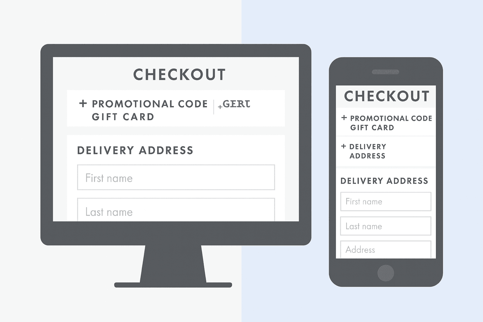
- Mobile Optimisation Failure: Even if the gateway is working, the checkout page itself is often not optimised for the small screen. When customers encounter long, cramped form fields, tiny buttons, or security icons that look blurry on their phone, trust immediately evaporates.
The Strategic Cost
This is a development issue with direct financial consequences.
If your checkout page isn't battle-tested across different devices and payment scenarios, you are treating your highest-intent shoppers like beta testers. Every technical glitch on this page sends customers directly to a competitor whose payment acceptance is reliable.
2: Memory Loss & Repetition
Are you punishing the user for trying to convert?
You know how frustrating it is when you’re filling out a long government form and accidentally hit refresh, wiping all your progress? That level of user hostility could be costing your business hundreds of sales a month.
The failures here are subtle, but they communicate one thing to the customer: "We didn't design this site for the way you actually shop."
The Technical Amnesia of the Shopping Cart
A modern ecommerce site must have a reliable memory. Unfortunately, many don't. This memory loss leads to instant friction and abandonment:
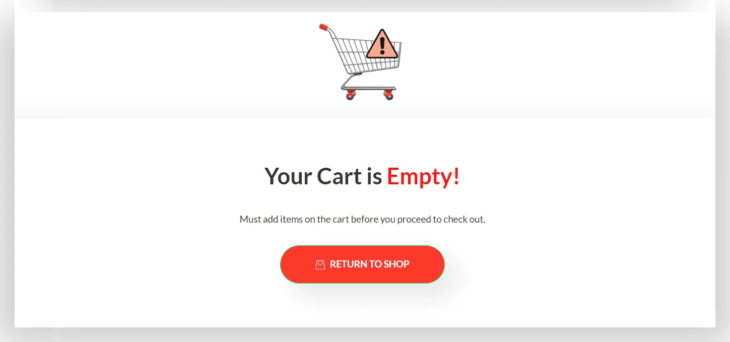
- The Logged-Out Trap: A customer browses for an hour, adds multiple items to their cart, and finally decides to log in. Upon login, their cart is instantly cleared. You've just punished a high-intent user for trying to convert.
- The Multi-Tab Failure: Shoppers compare products across tabs. When they jump back to their cart, it hasn't synced, displaying incorrect availability or an outdated total. This lack of multi-session continuity forces the customer to start validating their items all over again (or abandoning the purchase altogether which, let's admit, is a whole lot more likely).
- Session Timeout: A user starts shopping on their mobile in the morning and returns hours later after work to complete the sale, only to find the cart has cleared due to a premature session timeout.
The Frustration of Repetition
This is when the site forces the customer to repeat actions, wasting their valuable time.
Think about those annoying form issues:
- Data Wipe on Refresh: A simple error message or browser back button causes a page refresh, and all the delivery details they just entered are wiped clean.
- Unresponsive Lists: Long, unresponsive list options (like selecting a country or region) that require excessive, clunky scrolling or aren't connected to a fast-type/auto-select function.
These small, solvable failures don’t just cause a high bounce rate; they create real customer rage and send that hard-earned, high-value shopper straight to a competitor with a better-engineered experience.
3: The Information Drought
You can't buy what you can't compare.
The product detail page (PDP) is the final sales pitch, and in complex ecommerce categories, it's where trust is either earned or completely lost.
Many sites treat the PDP as a catalogue entry, not a conversion tool, resulting in an Information Drought.
Customers don't abandon because of price; they abandon because they lack the specific, measurable information needed to justify the purchase.
- Lacking Crucial Context: For technical items (electronics, machinery) or categories requiring high specificity (health, personal care, niche fashion), we consistently see pages lacking the core data needed to convert. For example, a page might describe a supplement as "powerful" but fail to list mg dosage or specific third-party certifications. A premium garment might skip crucial details on material composition or wash-care instructions.
- Poor Visual Experience: This is more than just low-resolution images. It's the failure to provide the contextual imagery that answers customer questions. For example, a fashion retailer showing only front-facing shots but lacking a crucial image of the garment lining or how it moves on a model. Or an electronics site that doesn't provide a clear view of the ports and rear panel. (This won't just harm your on-site experience, either - it'll risk your ability to show up in image search.)
- The Vague Claim: Relying on vague language ("innovative," "eco-friendly," "highest quality") instead of anchoring claims in measurable facts. Customers leave to search a competitor's site for the missing specifications they need for their internal comparison.
This friction point is an instant referral to a competitor. If a shopper has to search elsewhere for the specific details to feel confident in their purchase, they often complete the transaction there, too.
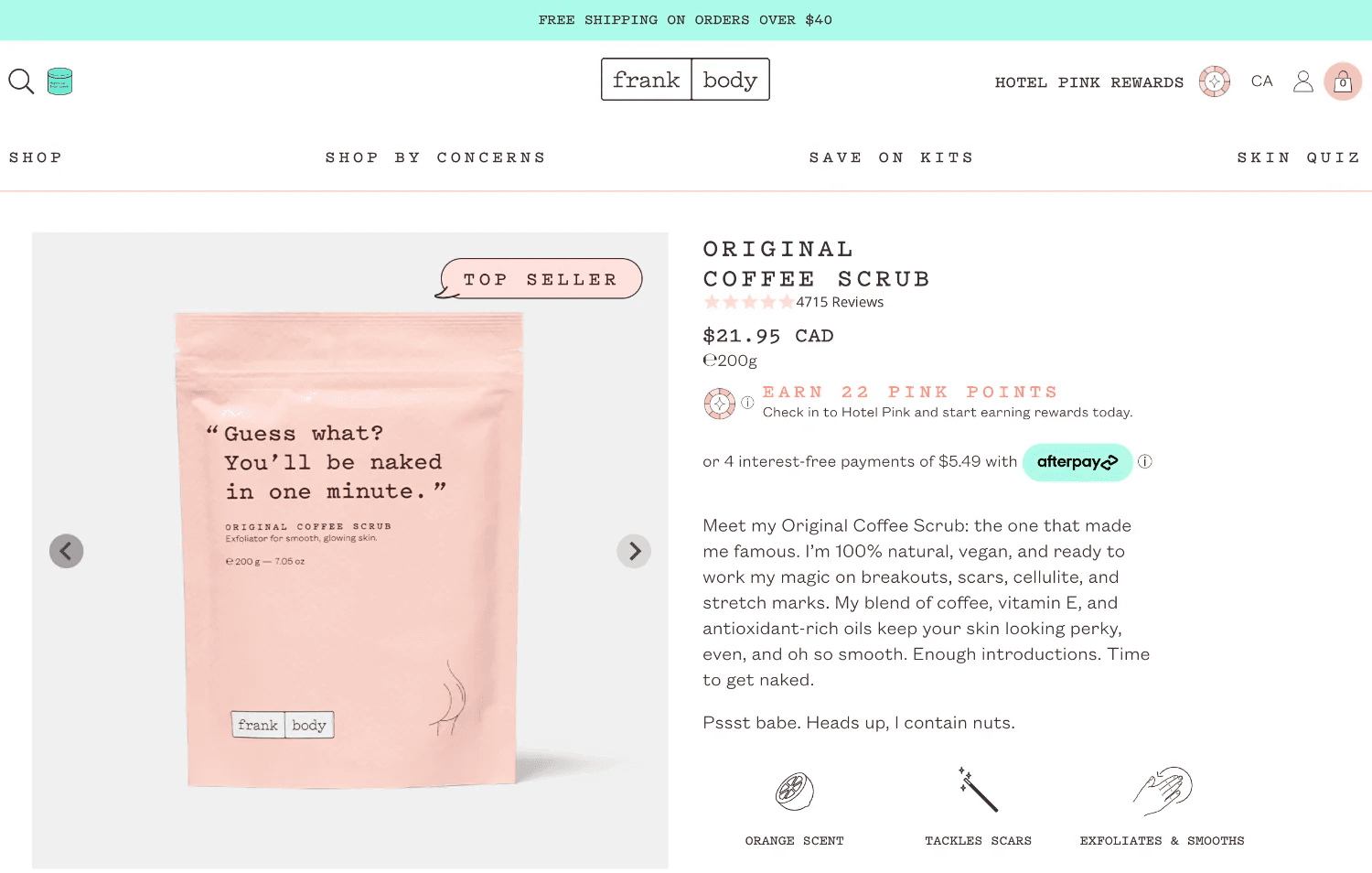
This is a great example of a personable, on-brand and helpful product description.
4: The Dead End
If customers can’t find it, you won't sell it.
You may have perfectly optimised product pages that rank on Google, but if a shopper landing on your homepage can't navigate to them intuitively, all that marketing budget is instantly wasted.
This is the internal visibility crisis - a development and design failure that costs sales at a massive scale.
This failure operates in two parts.
The Mobile Maze (Navigation Failure)
For a large percentage of your audience browsing on a small screen, the main site menu is a huge conversion killer.
We frequently see menus that are:
- Overwhelming and Clunky: Too many options presented at once, requiring excessive scrolling or hiding sub-categories behind non-obvious taps.
- Contextually Inappropriate: Navigation that works on a wide desktop screen but collapses into an unusable, multi-level dropdown on mobile.
When the primary means of exploration is frustrating, the user’s next step isn't patience - it’s hitting the back button.
The Broken Compass (Internal Search Failure)
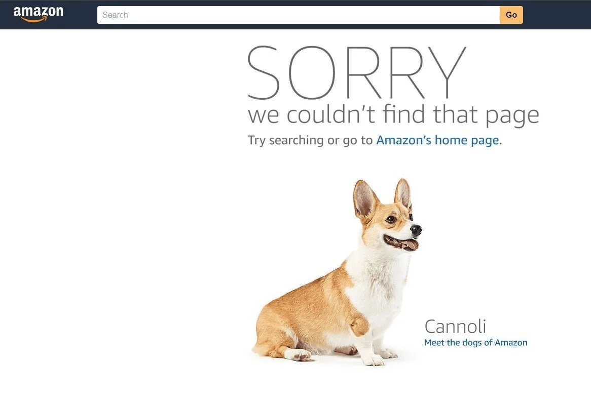
When a frustrated user bypasses your menu, they turn to your internal search engine as their final hope. If your search functionality is poor, it becomes a dead end.
The technical failures here are critical: the search bar returns zero results for simple synonyms, can't untangle simple spelling errors, lacks crucial filtering options, or fails to prioritise in-stock items.
The user types a high-intent query, sees "No Results Found," and instantly assumes you do not carry the item. That sale is then immediately lost to a competitor.
5: The Trust Deficit
The proof is no longer in the product, it’s in the citation.
The final conversion killer is one that no developer can code away: a lack of verifiable authenticity.
Today’s customers are expert skeptics. They know every brand claims to be the "best" or "highest quality," so they immediately seek external proof before they buy.
When a customer sees any of the following, they leave to find a competitor who can provide the necessary trust signals:
- The Review Vacuum: Pages or products display zero reviews. For the modern shopper, a complete absence of public feedback is often viewed as worse than a few mixed reviews. It suggests low credibility or a reluctance to engage with customers.
- Unmanaged Third-Party Profiles: You have a profile on Google, Trustpilot, or a niche review site, but it's outdated, unmanaged, or filled with unanswered negative feedback. This demonstrates a complete lack of accountability.
- Social and Service Failure: Poor social media management that fails to engage with customer queries or complaints. This signals that your customer service is inaccessible, creating a huge pre-purchase risk in the mind of the consumer.
The Cost of Credibility
This is a direct risk because trust is the ultimate conversion multiplier. Plus, as we saw in our blog on how AI influences brand perception, generative AI models rely entirely on these third-party profiles to build their "authoritative narrative."
If the AI can't find clear, positive external proof of your integrity, customers who ask an AI for a recommendation will never even see your brand name.
This Isn't a Marketing Problem; It’s Infrastructure.
The problem isn't that you lack great traffic; it's that your current infrastructure - your code, your UX, and your design - can't hold onto it. These five friction points are not minor issues; they are quantifiable revenue leaks.
The real performance killer isn't a complex algorithm; it’s assuming your current setup is flawless. Every technical breakdown, every moment of UX friction, is a point where a paying customer quits. You can no longer afford to treat development, design, and Conversion Rate Optimisation (CRO) as separate entities.
Stopping this leakage requires a holistic team that can combine data science, human-centred design, and expert code to fix these critical, quantifiable UX failures.
Need help identifying the hidden leaks in your funnel? Let's talk strategy.
Did you miss our first two instalments?